 Click here to see us on Facebook
  Follow Me on Pinterest
Contrast
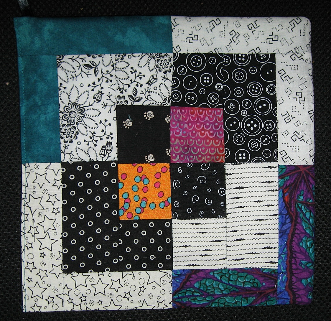
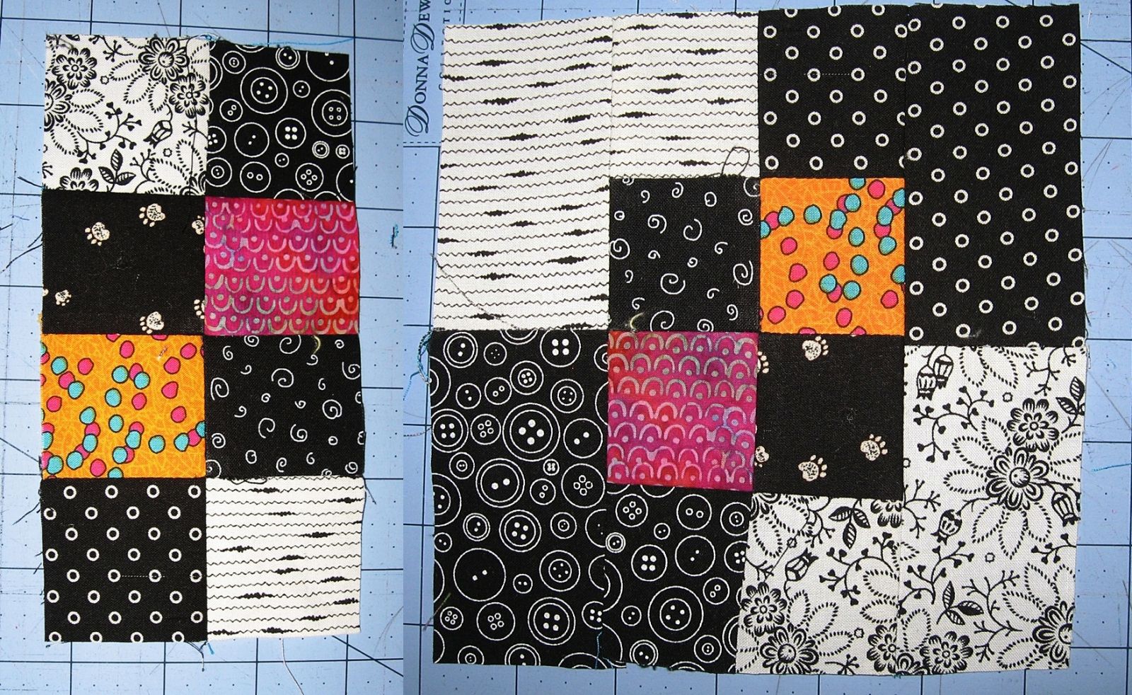 I love these black and white hot pads, I could make them all day. The contrast is what I like and it lends itself to using up all sorts of scraps one has left from different projects, the brighter, the better. The actual design is very simple. The center is a 4 patches consisting of 2 black (or white) prints teamed up with 2 bright prints.. Next a black and white pair is attached to the top and the bottom of the 4 patch so now you have 4 sets of 2" blocks sewn one on top of the other. Next, two 3 1/2" white strips are sewn end to end to two 3 1/2" black strips and then attached to each side of the 2" block assembly with the seam of the 3 1/2" strips lining up with the center seam of the 4 patch block. This makes a 6 1/2" square. Now 2 - 8 1/2" strips of 2 colorful prints are sewn end to end to the white prints and attached and that is all there is too it. Most of the work is in choosing which colorful fabrics to use. The center 4 patch can also feature white prints rather than black, depending on what tone of fabric one is using for the colored prints. If I am using darker jewel toned prints for the center, then it is best to pair them up the white, since this block IS all about contrast.
- Sandy's blog
- Log in to post comments